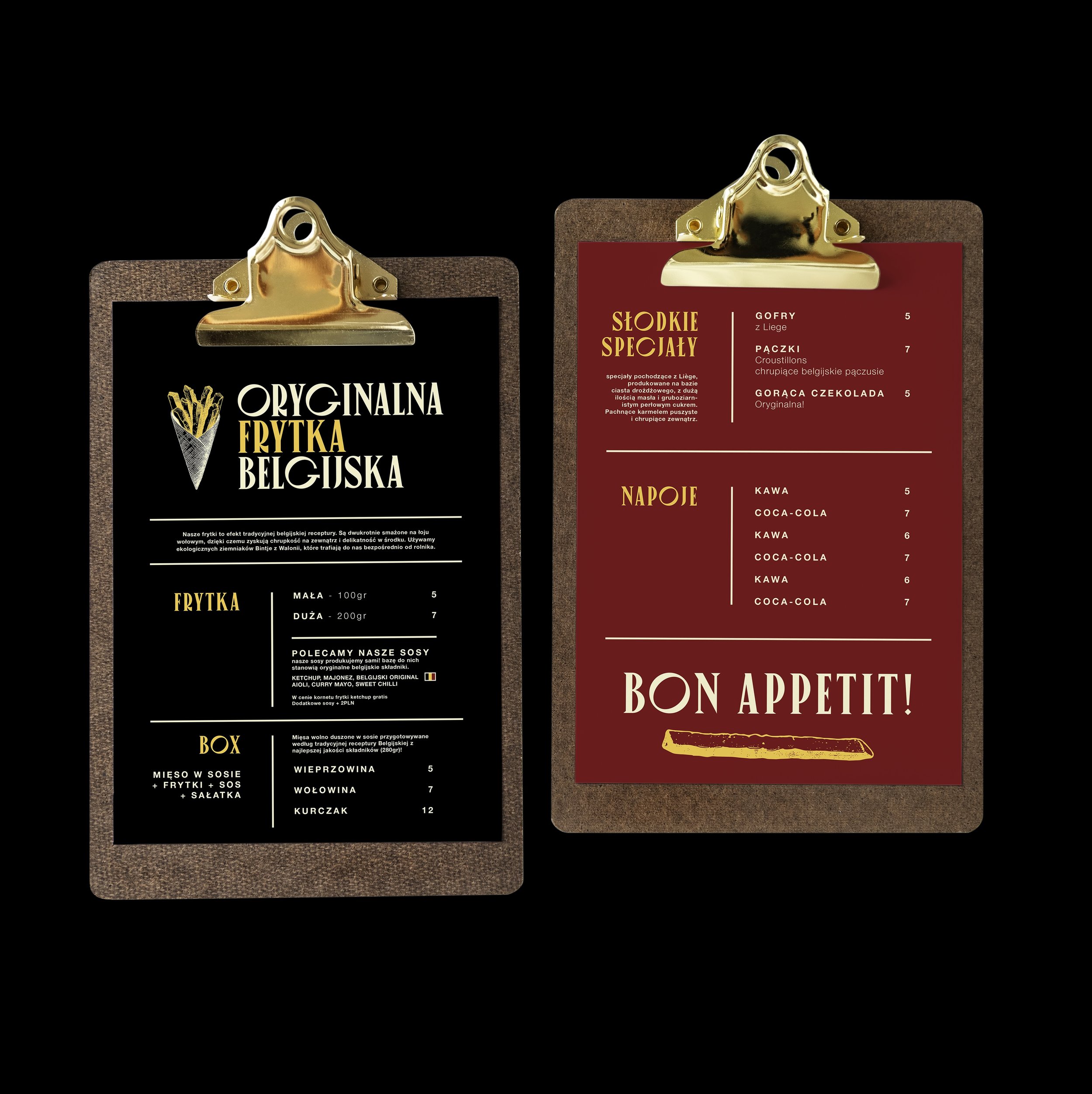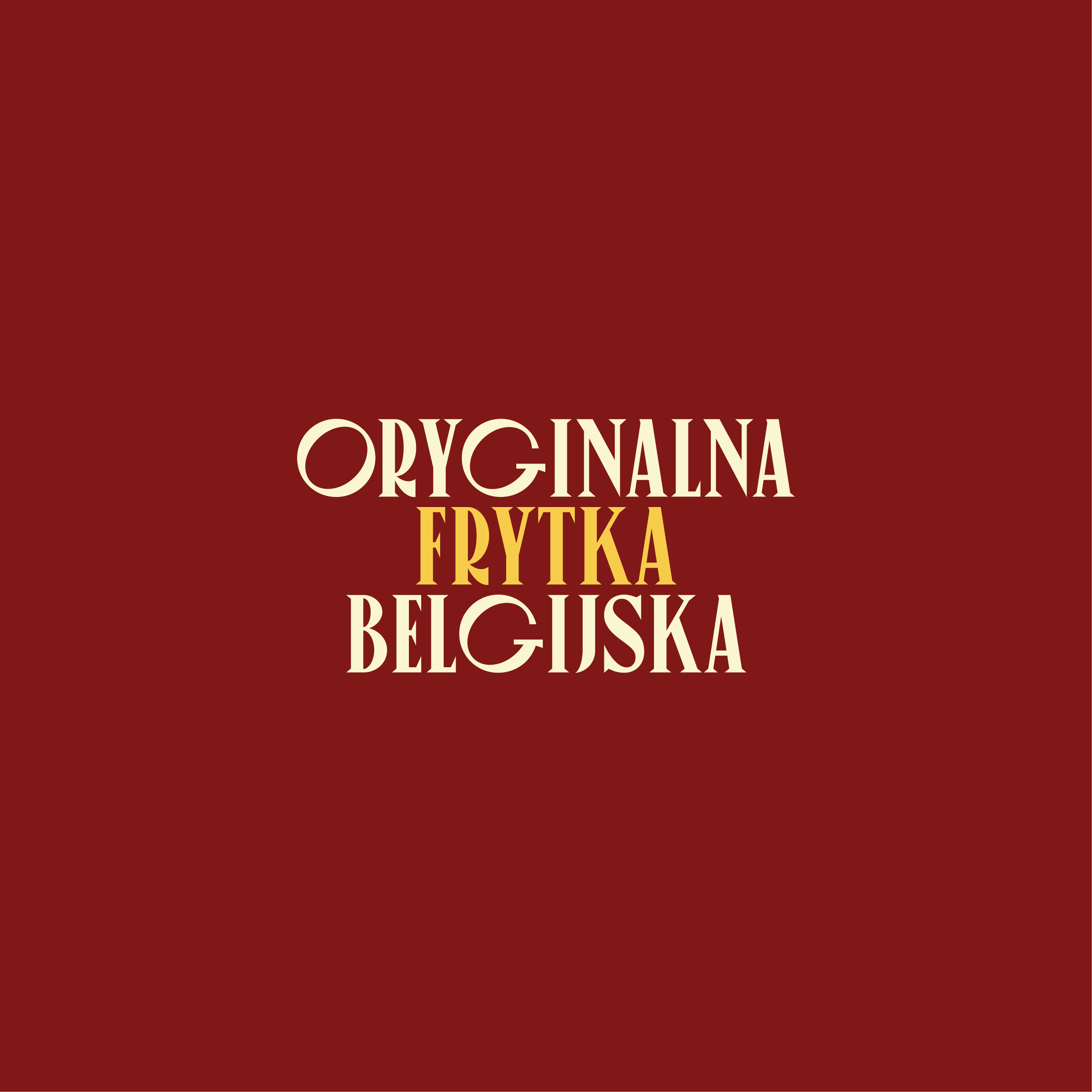

Oryginalna Frytka Belgijska
Oryginalna Frytka Belgijska is a new street food brand bringing the true taste of Belgium to Poland. Focused on quality and tradition, their fries are made with specially selected potatoes, fried in authentic Belgian fat, and served with original sauces that elevate every bite. Alongside, they offer real Belgian waffles—crisp, surprising, and unlike anything most Poles have tried before.
This is more than fast food—it’s a cultural experience. The shop is designed to capture the relaxed, charming vibe of Belgium, where fries are a national treasure and food is treated with care and pride. The branding reflects this spirit: warm, playful, and full of character—just like a stroll through a Belgian street, cone of fries in hand.
-
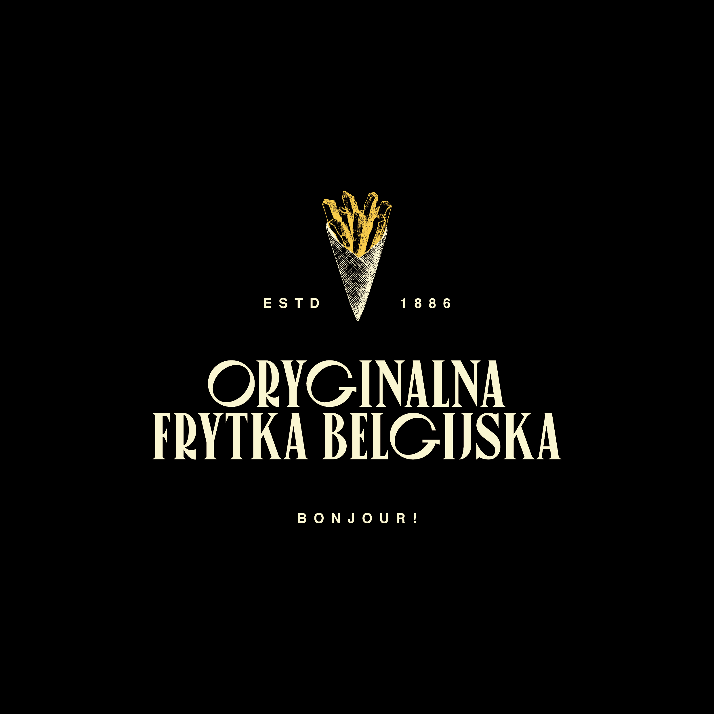
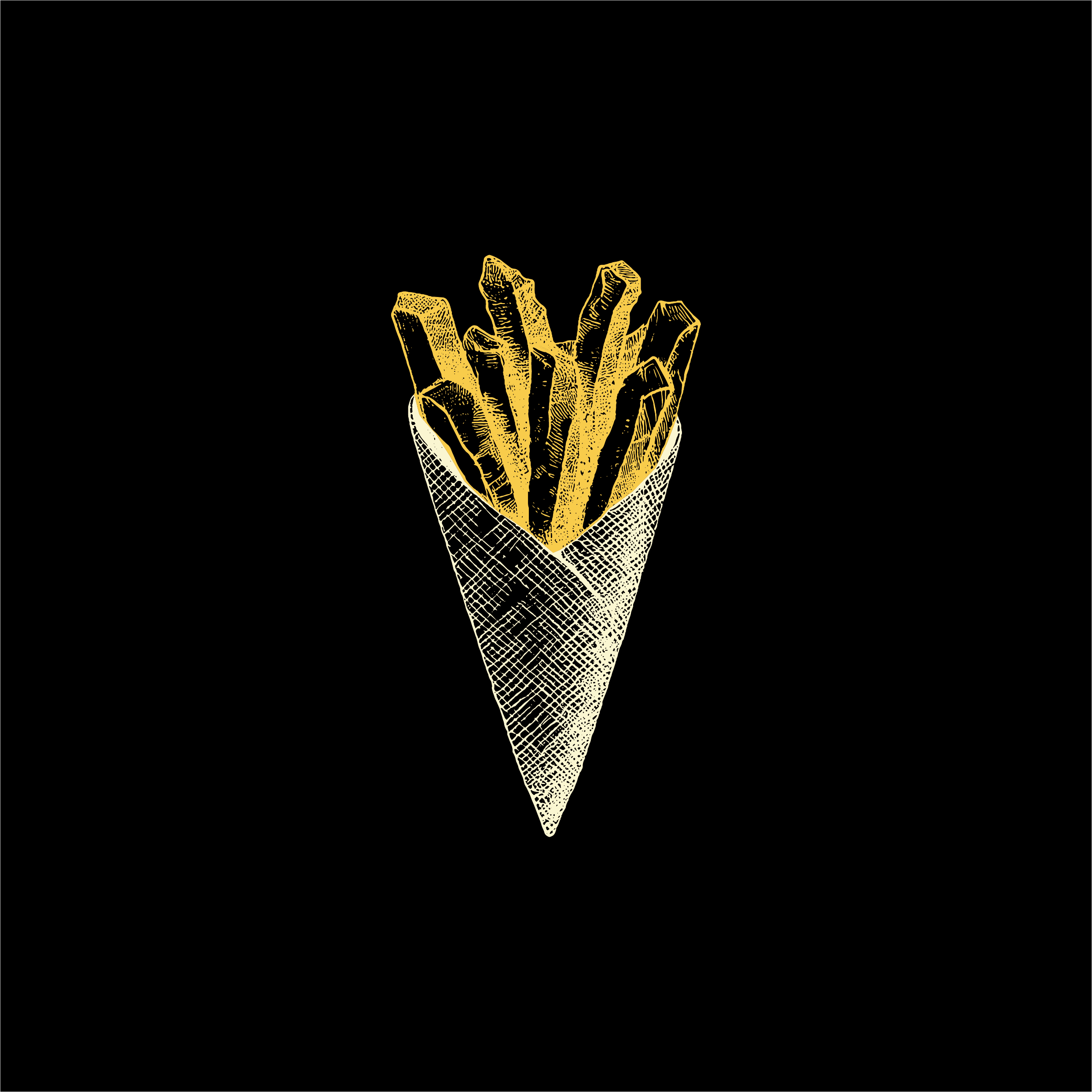
The Oryginalna Frytka Belgijska logo brings together four key elements: the brand name, a detailed cone of fries, the founding year, and the slogan “Bonjour.” The illustration, inspired by vintage botanical encyclopedias, is rich in detail yet keeps a clean, modern look. The cone takes center stage, immediately evoking Belgian street food culture. The main font adds personality and charm, tying the visual identity together with a balance of simplicity, character, and a warm, welcoming vibe.
-
The color palette of Oryginalna Frytka Belgijska was carefully chosen to reflect both Belgian heritage and the brand’s personality. Off-white brings a subtle, vintage feel that speaks to authenticity and tradition. Golden yellow represents the “royal fry”—a nod to quality and iconic status. Red stands for passion, a love of food, and the vibrant energy shared with every customer. Inspired by the Belgian flag and classic sauces like mayo, ketchup, and mustard, the palette is both distinctive and delicious—capturing the spirit, flavor, and warmth of the brand.
-
The illustration style of Oryginalna Frytka Belgijska is inspired by vintage botanical prints and copperplate engraving, bringing a sense of elegance and authenticity to the brand. Most illustrations are presented in a single color to maintain a classic, cohesive look. The exception is the Belgian flag, which is always shown in its original colors to honor the brand’s national roots. The illustrations highlight iconic Belgian elements—such as the country’s shape, a lion’s head, the flag, and culinary symbols like a traditional waffle or a freshly made fry—creating a rich visual story of heritage and flavor.
-
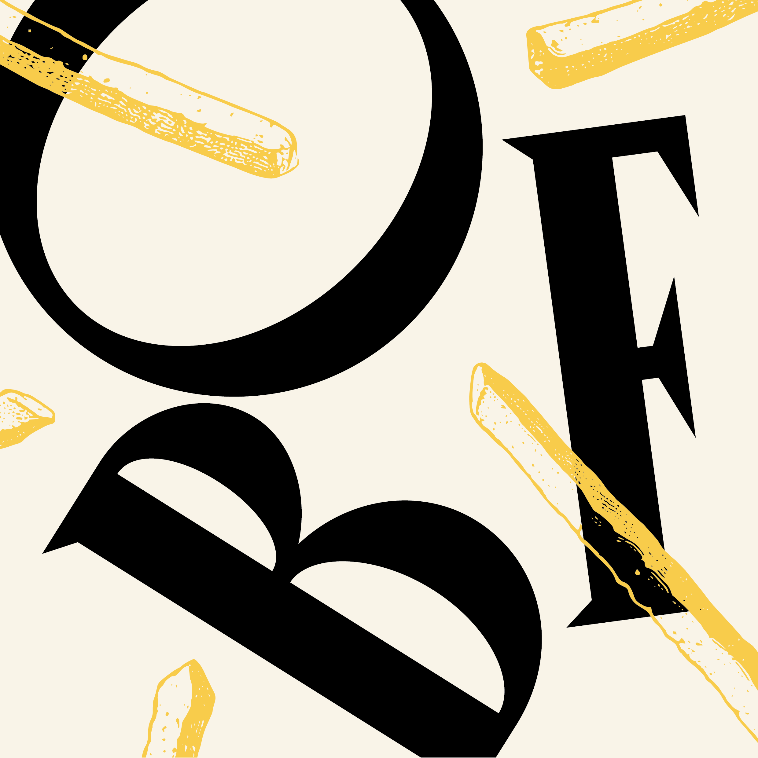
Oryginalna Frytka Belgijska combines the bold character of Canopee with the clarity of Helvetica. Canopee, used for titles and slogans, brings a modern yet elegant feel that reflects the brand’s authentic and friendly spirit. Paired with Helvetica for body text, the combination ensures strong personality with clean, easy-to-read communication.