
Gotujemy Dla Dzieci
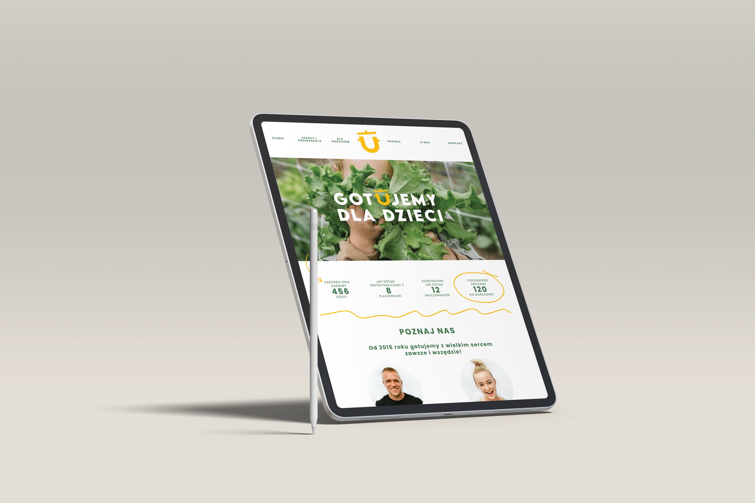
Gotujemy Dla Dzieci is a catering company based in Poland, that provides healthy, high-quality, and tasty meals to schools while promoting nutritional education and fighting against the inadequate approach to children's nutrition. GDD believes that every child deserves meals that not only satisfy hunger but also support healthy development, are full of flavor, and prepared with their well-being in mind. Gotujemy Dla Dzieci aims to positively impact health and mental development through nutritional education and the quality of the meals served, promoting a healthier lifestyle for children, their families, and teachers from the earliest years.
-
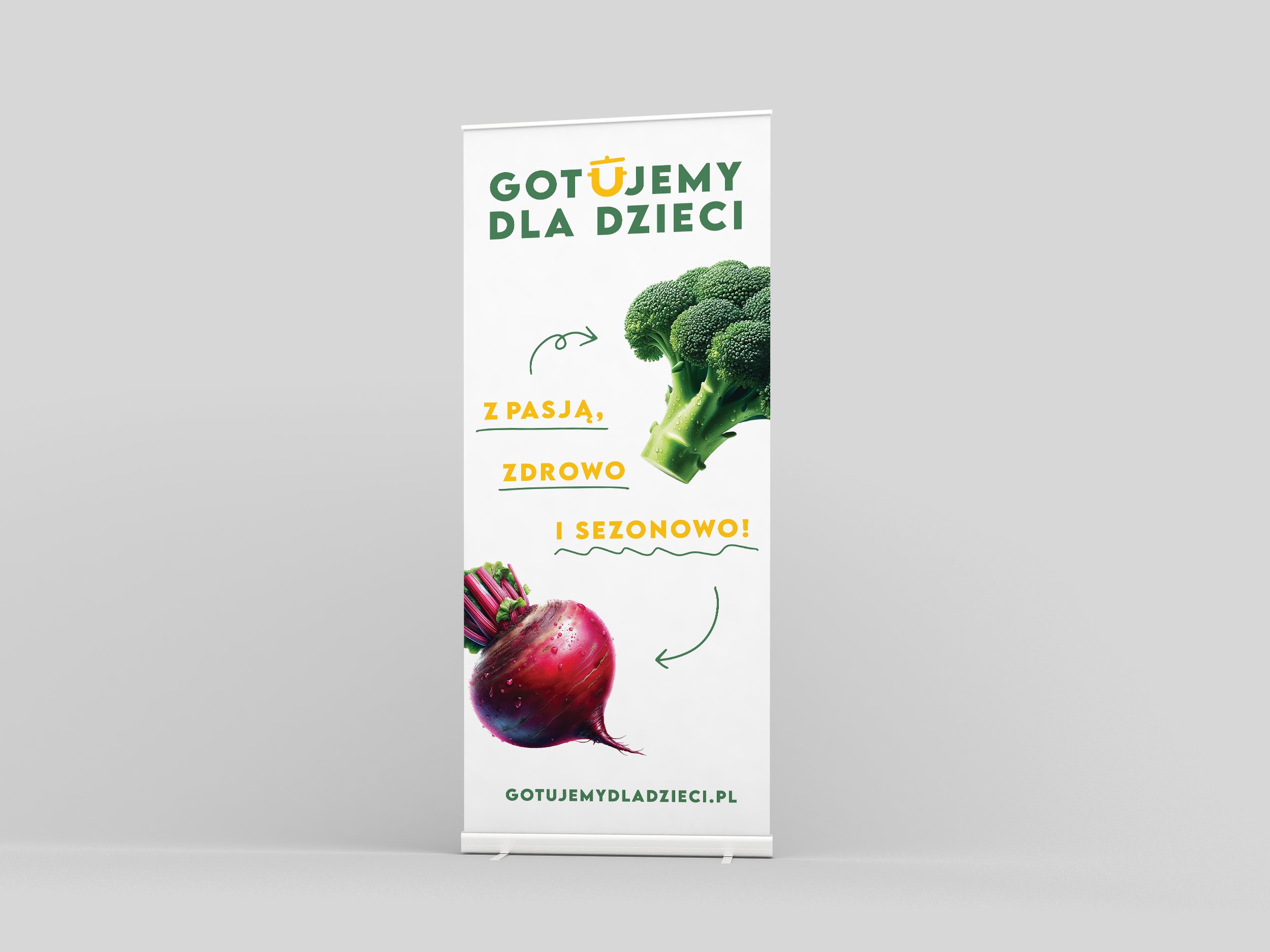
The logo is designed for clear, memorable communication of the mission and values, featuring a cooking pot symbol in place of the letter "U" to highlight the focus on meal preparation and healthy eating. Its modern, minimalistic style and carefully selected, reader-friendly font make it appealing and accessible, especially to young audiences and their parents.
-
Among the visual assets of Gotujemy Dla Dzieci, arrows and hand-drawn doodles play a significant role in adding lightness and dynamism to our messages. These friendly and informal graphic elements can be used independently or in conjunction with text and images to give our communications a fun and lively character. The doodles are particularly effective as accents—they can highlight, emphasize, or underline important information, drawing the viewer's eye and making key messages more memorable.
-
Gotujemy Dla Dzieci's photography style, inspired by "food porn," showcases vegetables in bright, vivid colors with water droplets to enhance their freshness and appeal, against a consistently white background to emphasize purity and focus. The dynamic and creative compositions, reminiscent of McDonald’s advertising, are designed to capture attention and stimulate appetite. This approach extends to images featuring interactions between adults and children, highlighting the communal joy of sharing healthy, delicious meals, with the white backdrop adding a sense of freshness and clarity.
-
The corporate color palette of Gotujemy Dla Dzieci is based on three main colors: white, green, and yellow, each chosen for their representation and impact on our brand perception. White symbolizes purity, freshness, and simplicity, reflecting our approach to preparing healthy, uncomplicated meals for children. Green represents nature, growth, and harmony, highlighting our commitment to using natural, seasonal ingredients and promoting a healthy lifestyle. Yellow adds energy, optimism, and warmth, aiming to create a positive, friendly atmosphere around our brand.