Naming + Logo + Branding Design
Erries is a company that provides its consumers with the best quality berries all year round.
The idea for the naming came from a quote: ‘I love berries. Strawberries, blueberries, raspberries, blackberries, anything with an ‘eerie’ in it’. We fell in love with the short and playful word ‘Erries’ that perfectly captures the essence of the company.


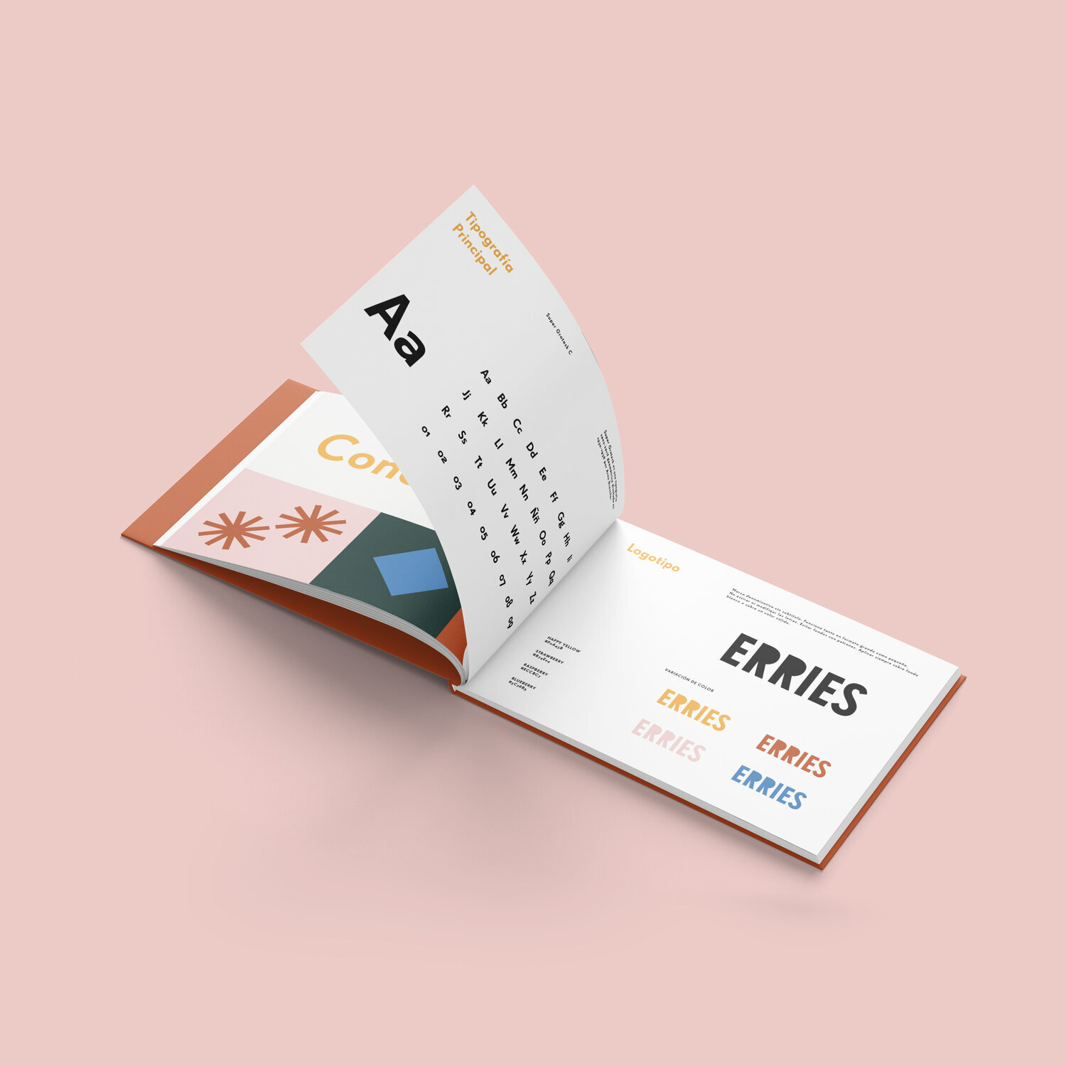
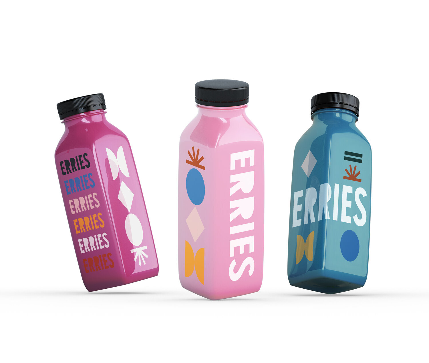
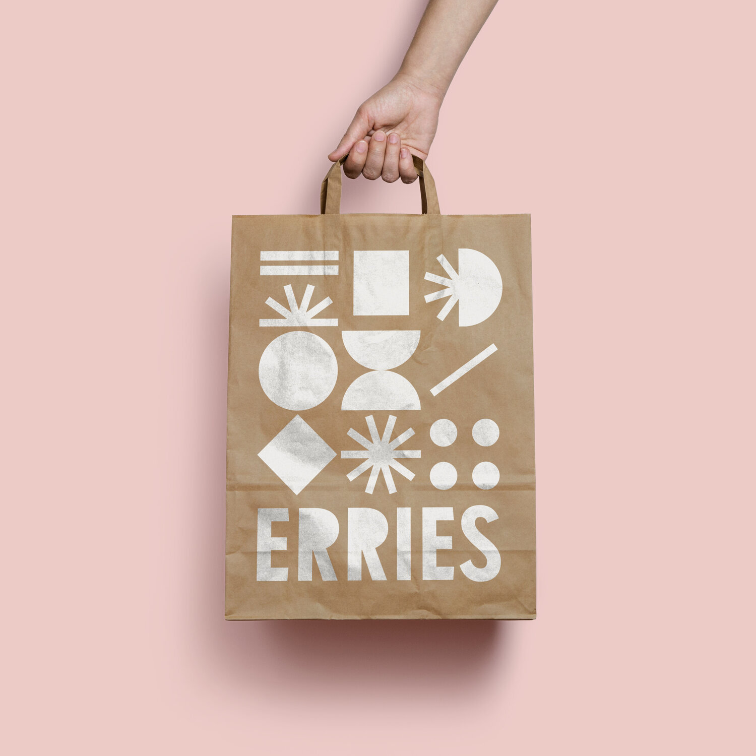
The branding is created around a collection of abstract geometric shapes inspired by fruits. These shapes can be used in an infinite amount of color combinations and patterns which gives additional depth to the identity of the brand.
First Erries products will be introduced to the market in Spain & Europe in the beginning of 2021!
Project created in January 2021

