Branding Identity, logo & illustration design
Semillero Project is a small collective based in the south of Spain (Cadiz area) that focuses on the development of sustainable agriculture. They define themselves as a ‘Gardening Club by Sea Lovers’. I see them as a community of humble surfers, trying to give back to Mother Earth, one lettuce at a time :)
About the design process
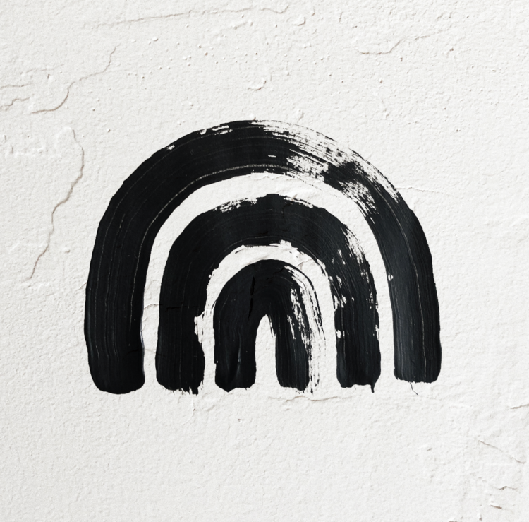
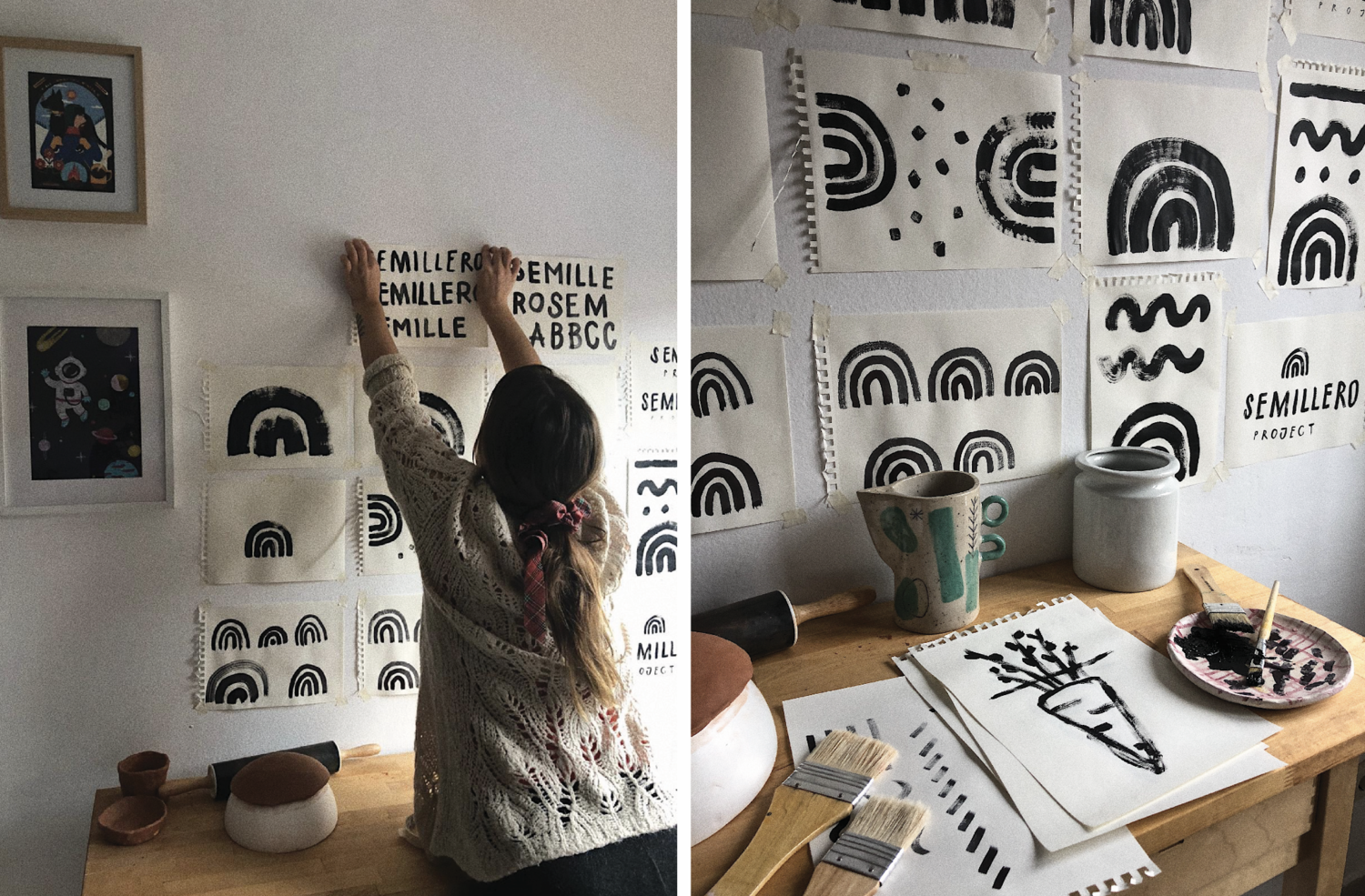
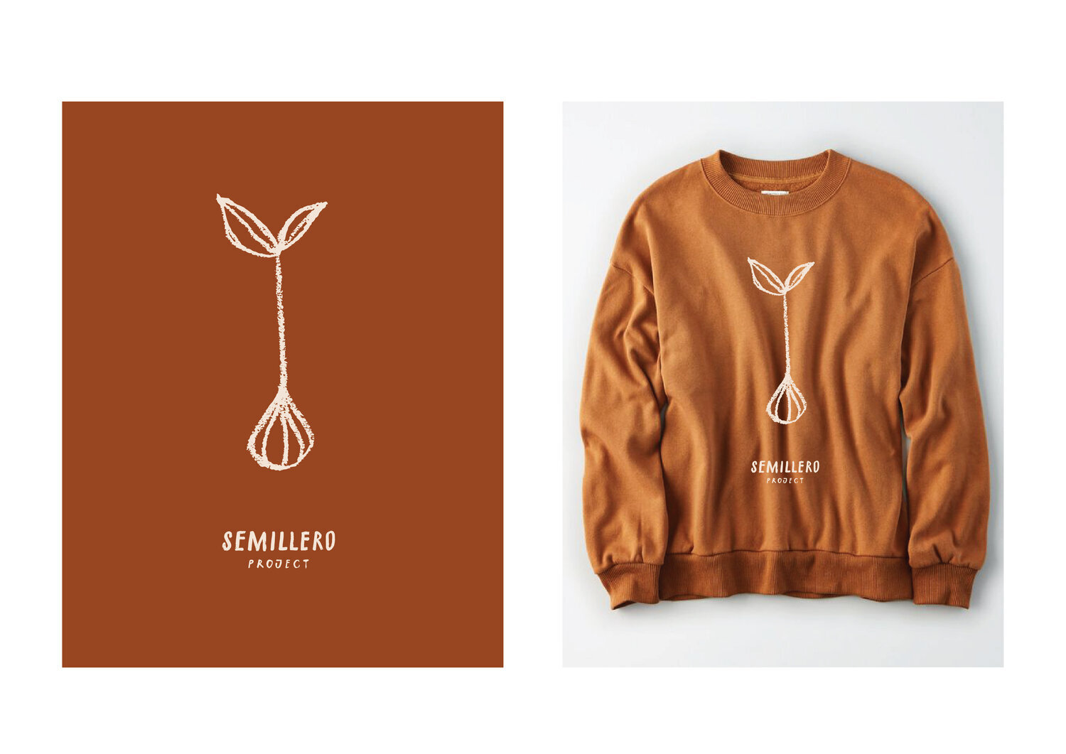
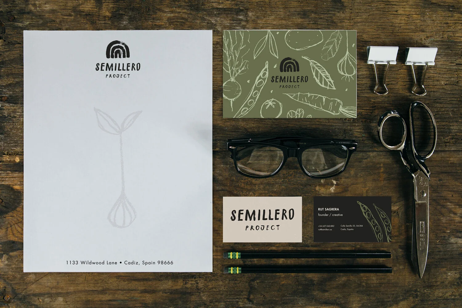
In this identity, we really focused on transmitting that handmade, earthy feeling. Each element of the logo was painted by hand with patience and love - the key values of Semillero Project.
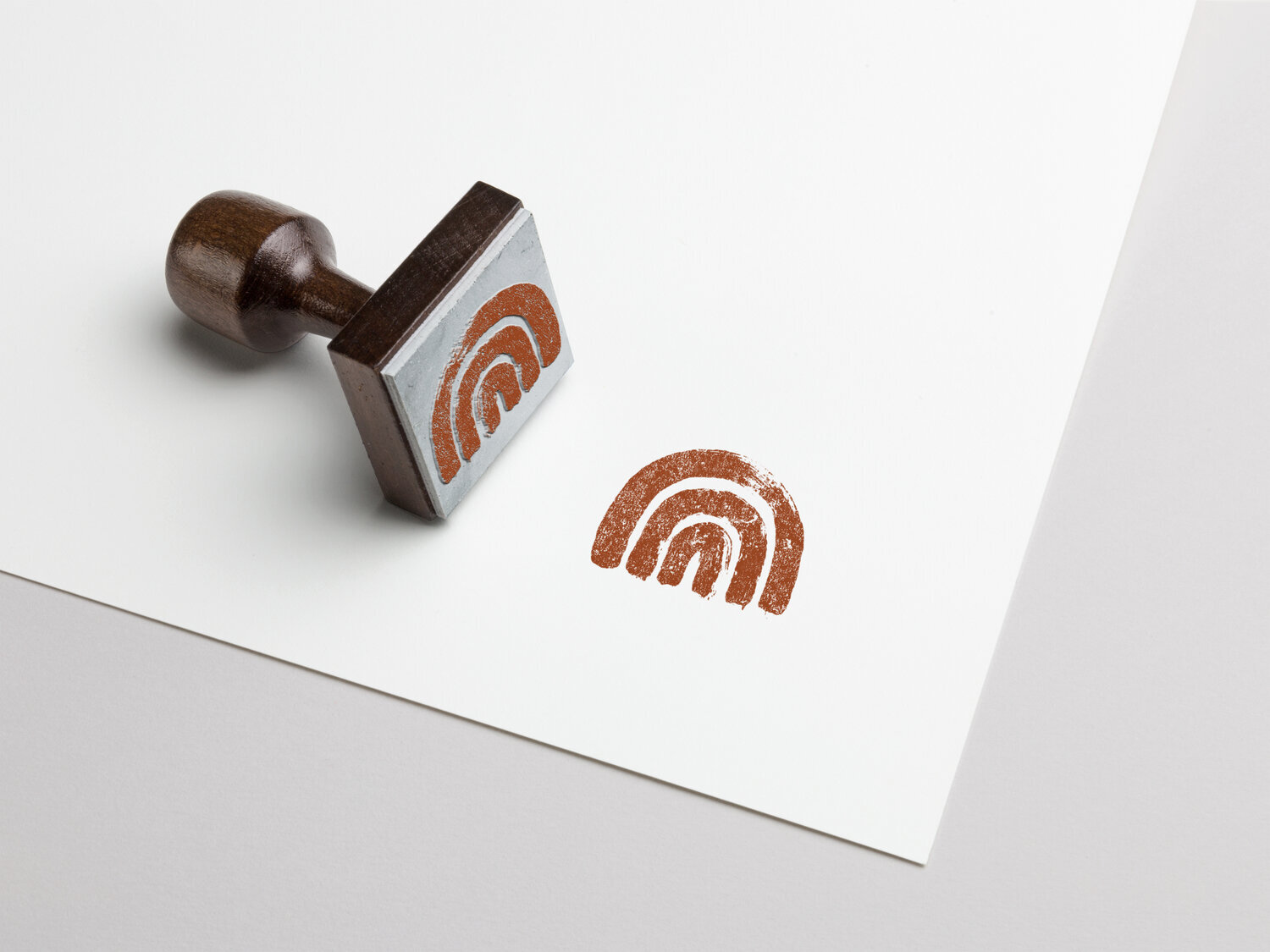
For the icon, we chose an imperfect rainbow arc, a symbol of peace, and serenity. These feelings are often evoked when looking at a rainbow. It is often seen after a rainstorm when the sun breaks through the clouds.
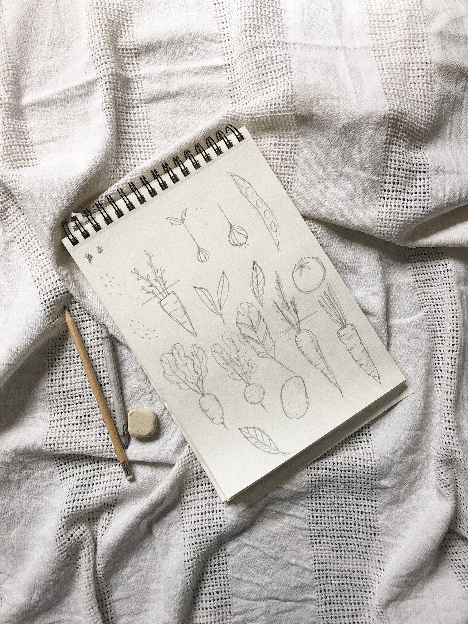
The illustration style that we picked for SP is obviously handmade, fragile, imperfect pencil strokes, showing the texture of the paper.
Project developed in March 2020
