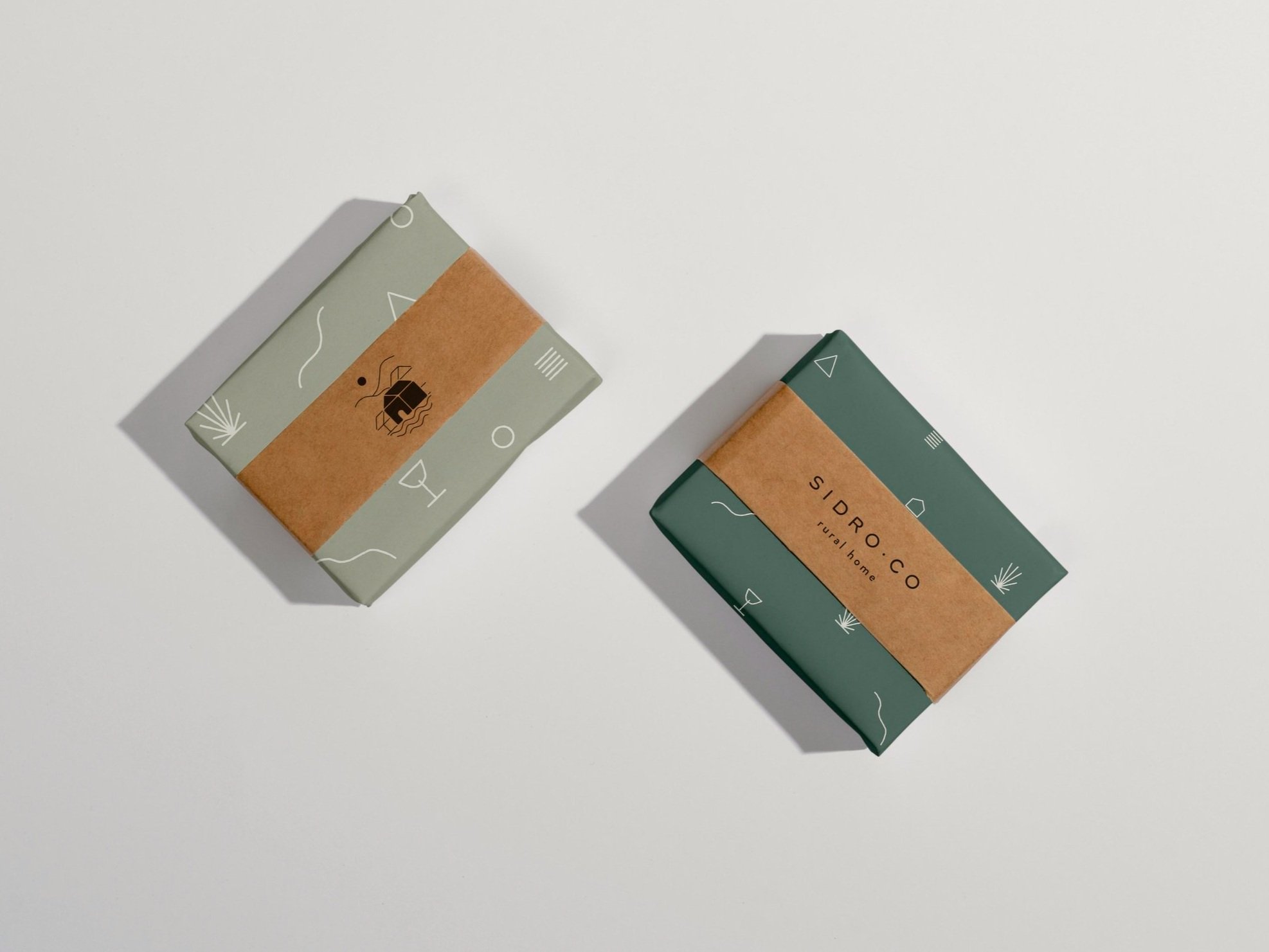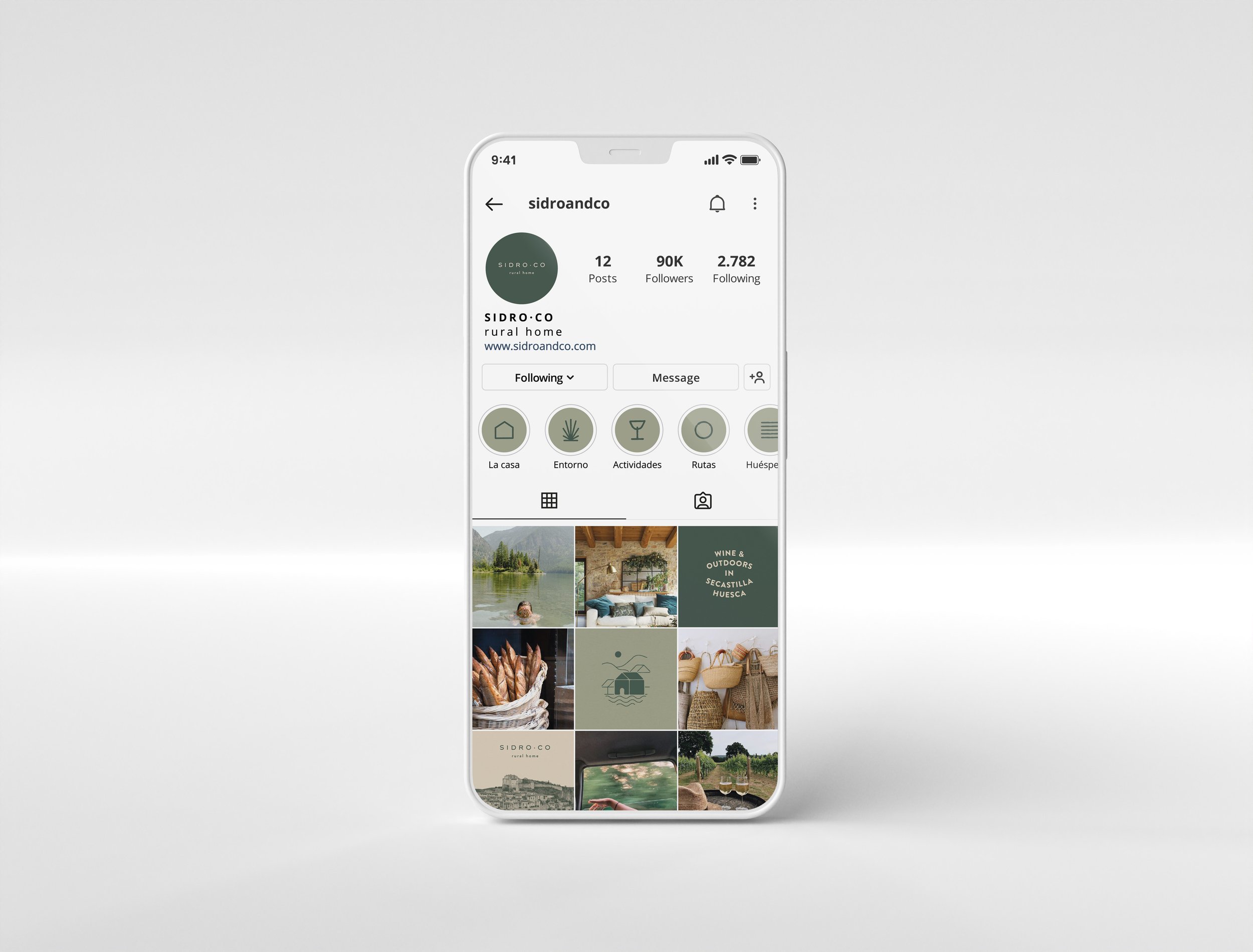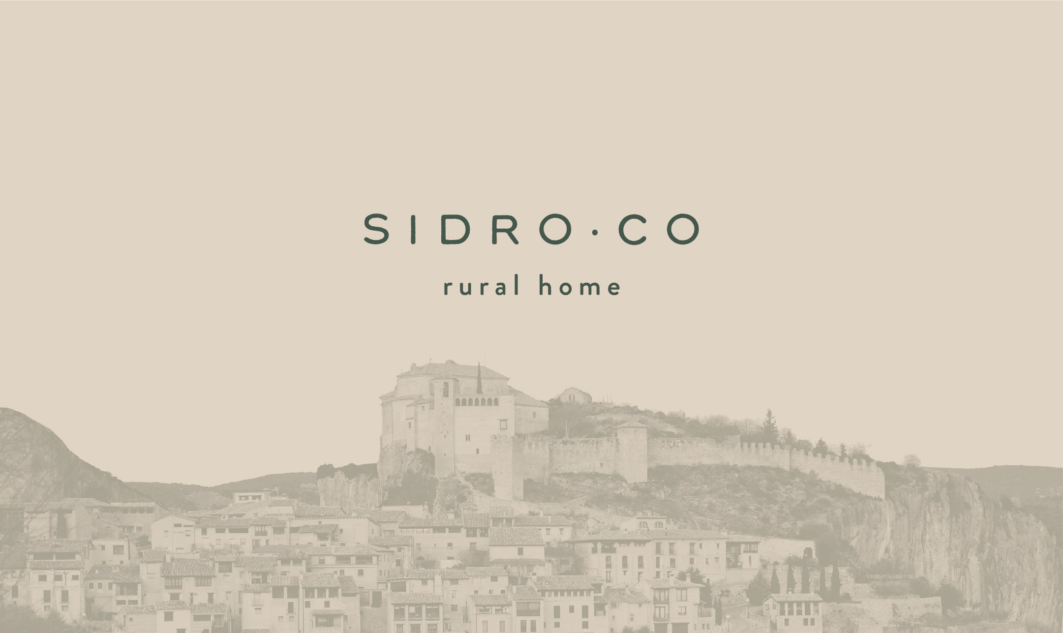
SIDRO·CO
Naming + Branding Identity
Sidro·Co is a rural house that makes their guests feel right at home. Everyone who comes to visit immediately falls in love with the house and the area and wants to return.
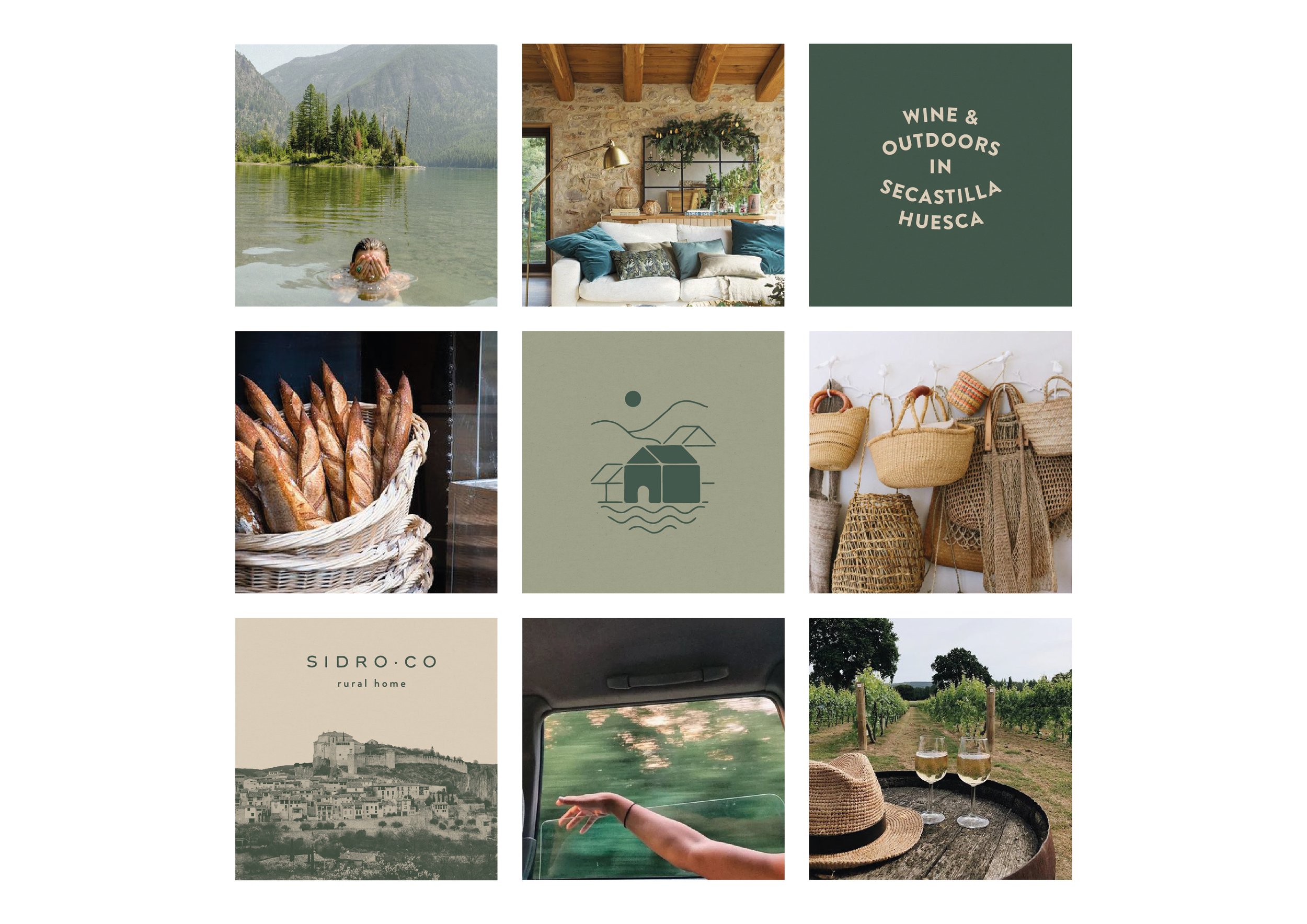
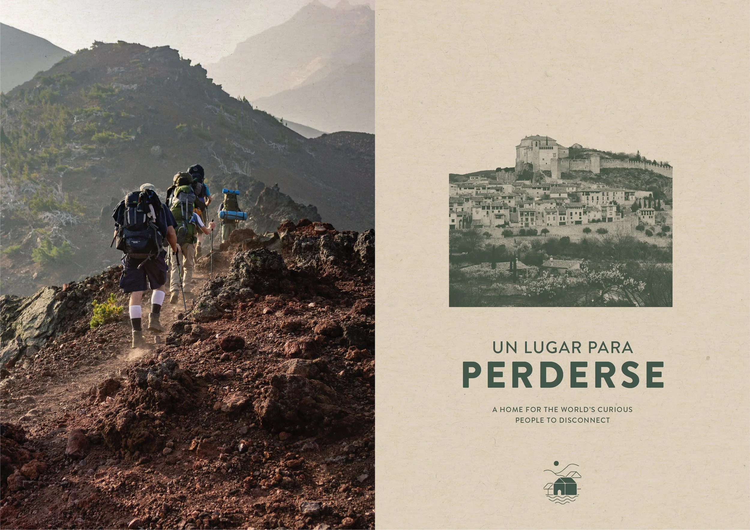
Sidro·Co is located in Secastilla, a small charming rural town in Huesca (Spain), right on the border between the Ribagorza and Somontano counties. Secastilla has a great wine tradition and is known for the production of olive oil. It is a traditional and beautiful town surrounded by numerous points of interest, which makes the area even more attractive.
About the project
Naming
The Sidro·Co house has been there for a very long time and is a part of the Secastilla history. It has always been known as Casa Sidro and that is how he locals refer to it. The town has a very nice tradition of calling the people who live in a given house by the houses name. For example Irene (one of the owners of Sidro·Co) is referred to by the locals as Irene Sidro. In the effort of respecting the heritage of the place we decided to maintain the word Sidro in the naming, but got rid of the word Casa and gave it a modern twist. We added a dot that represents connection and CO that stands for company.
Location Visit
For this project we decided to break the routine and take a road-trip to do a in person visit of the place. Secastilla is located about 250km from Barcelona, but it was worth the drive! The visit helped us in better understanding the house and the area, it was a direct injection of inspiration for the branding identity design. Meeting Irene and Javi (the owners) in person and listening to them talk about their passion project made me fall in love with the area, which I hope was transmitted through the design.
Logo
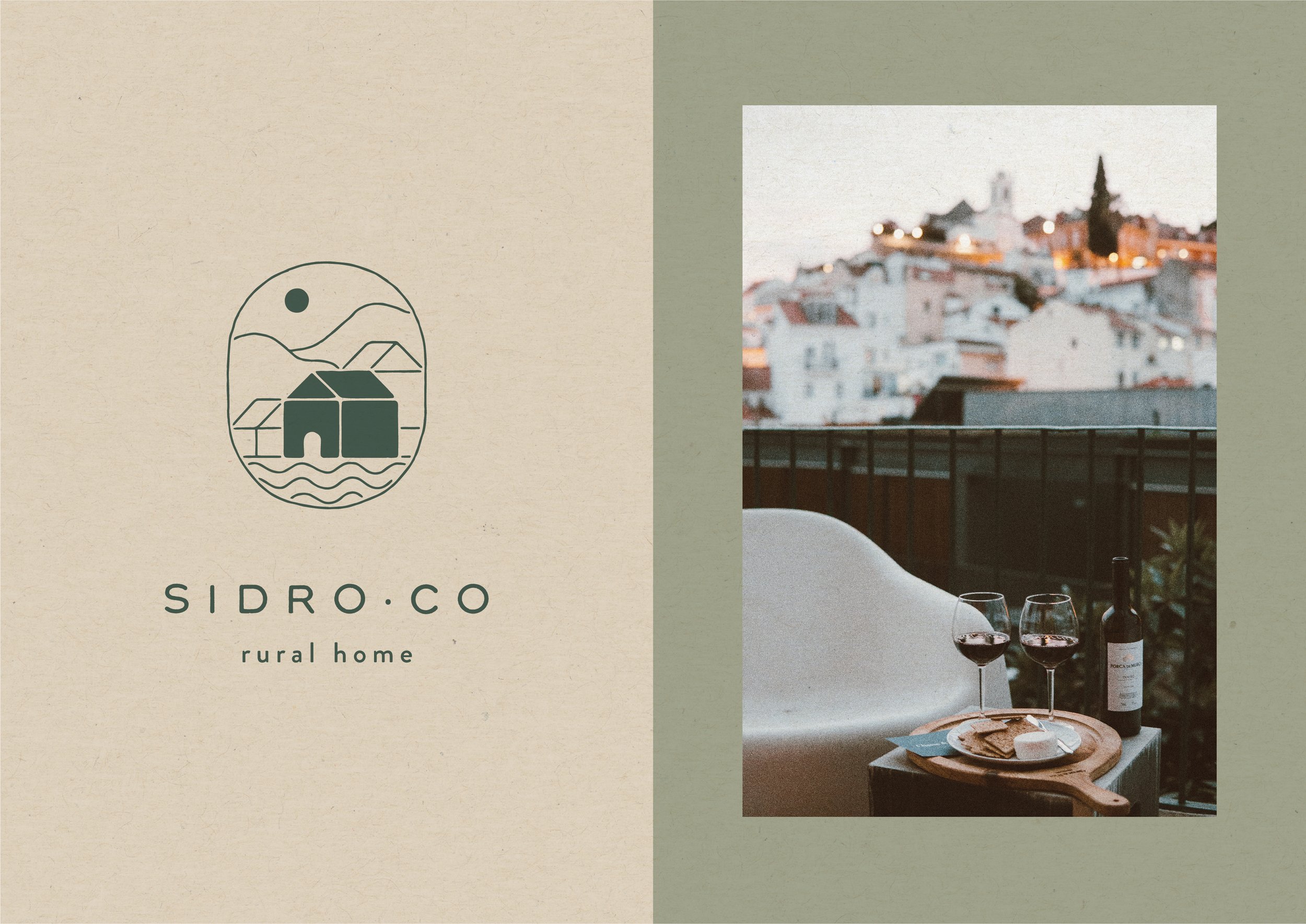
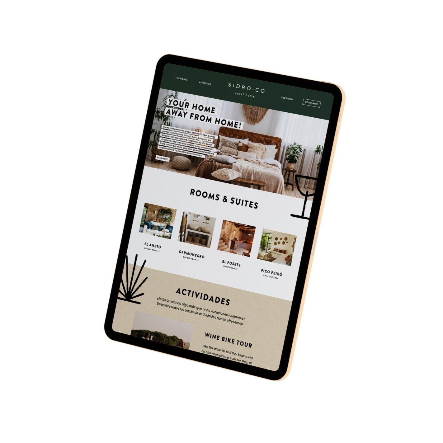
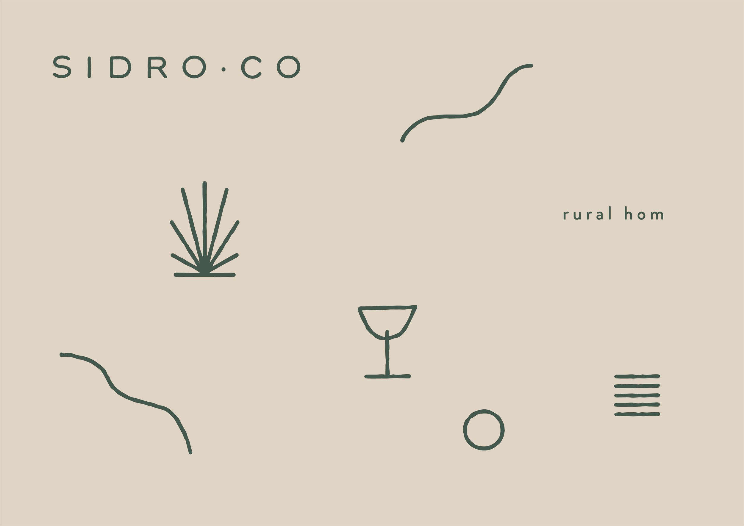
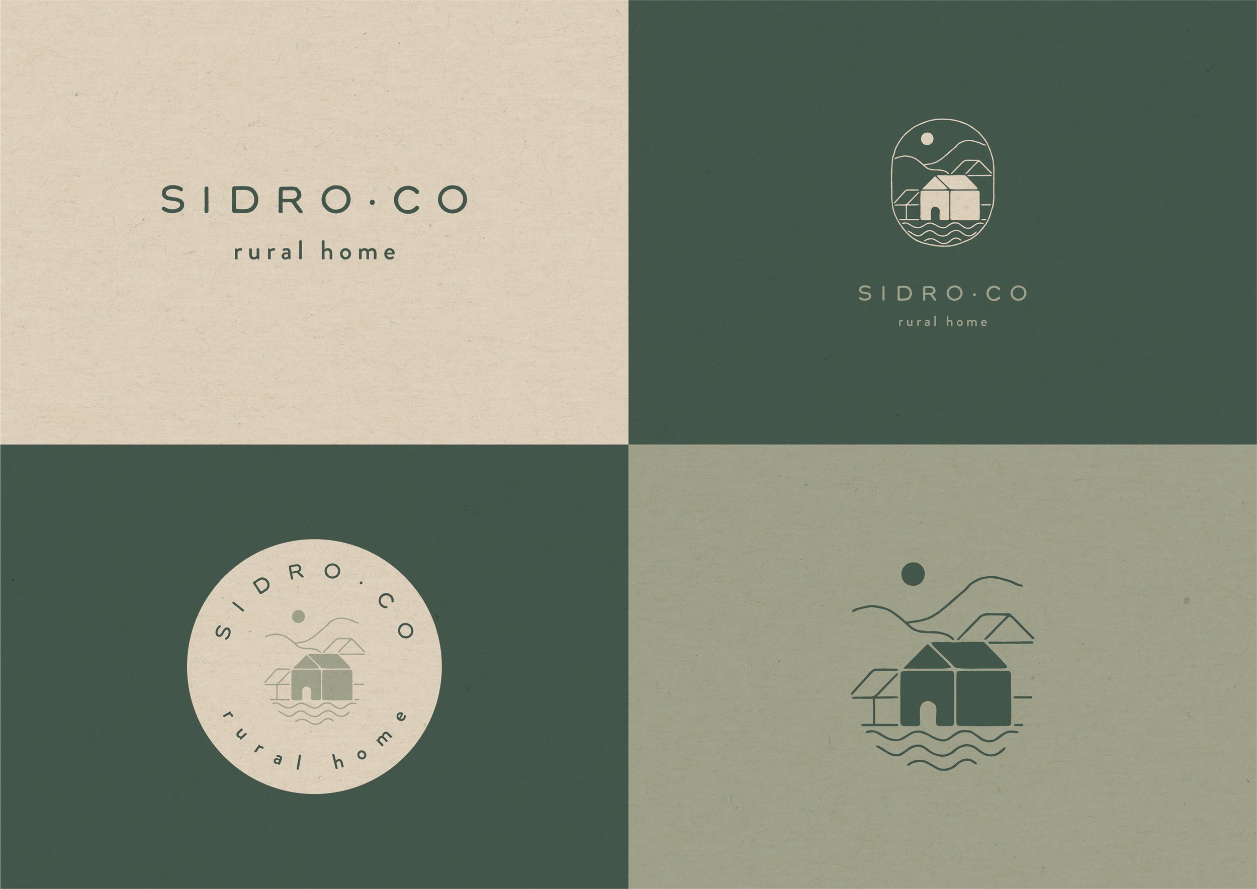
To convey the brand's strong link with nature and rural tourism, the logo has been created using a slightly flattened sans-serif typeface with organic lines. Generous spacing between characters gives it lightweight look and makes it breathe. The imperfections give it handmade and bohemian vibe.
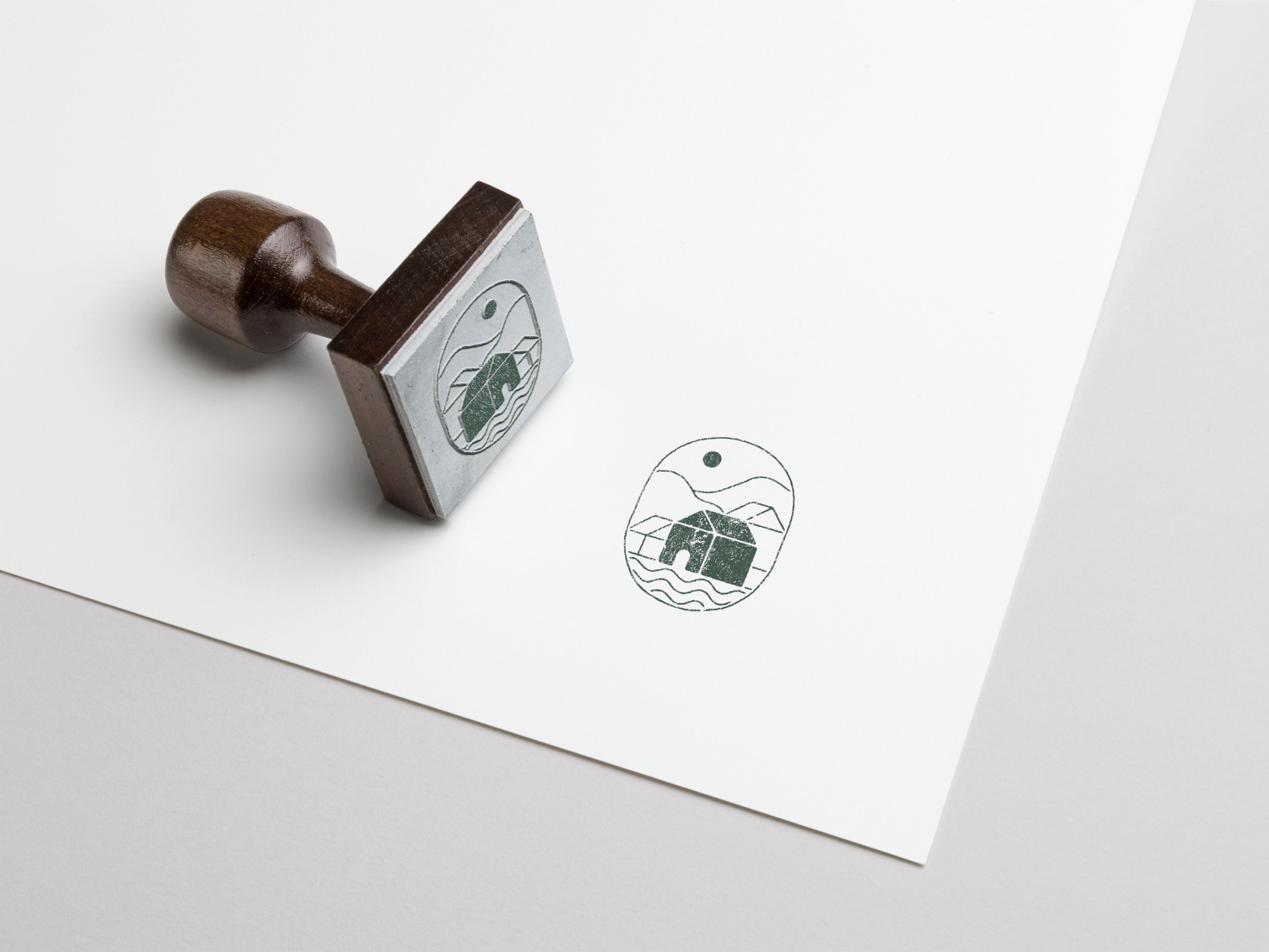
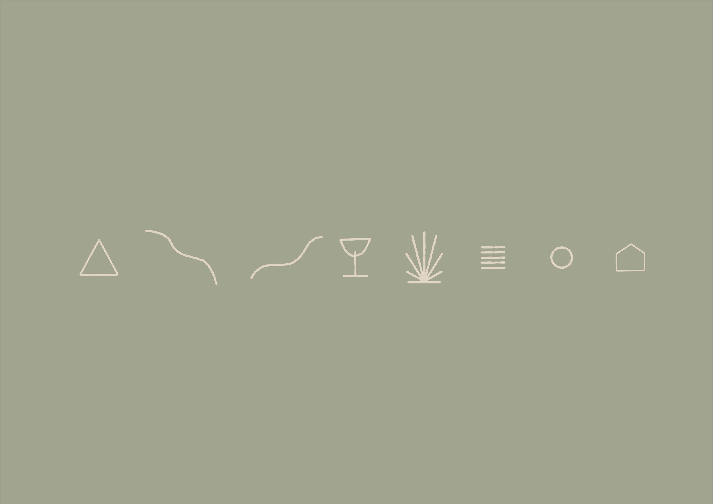
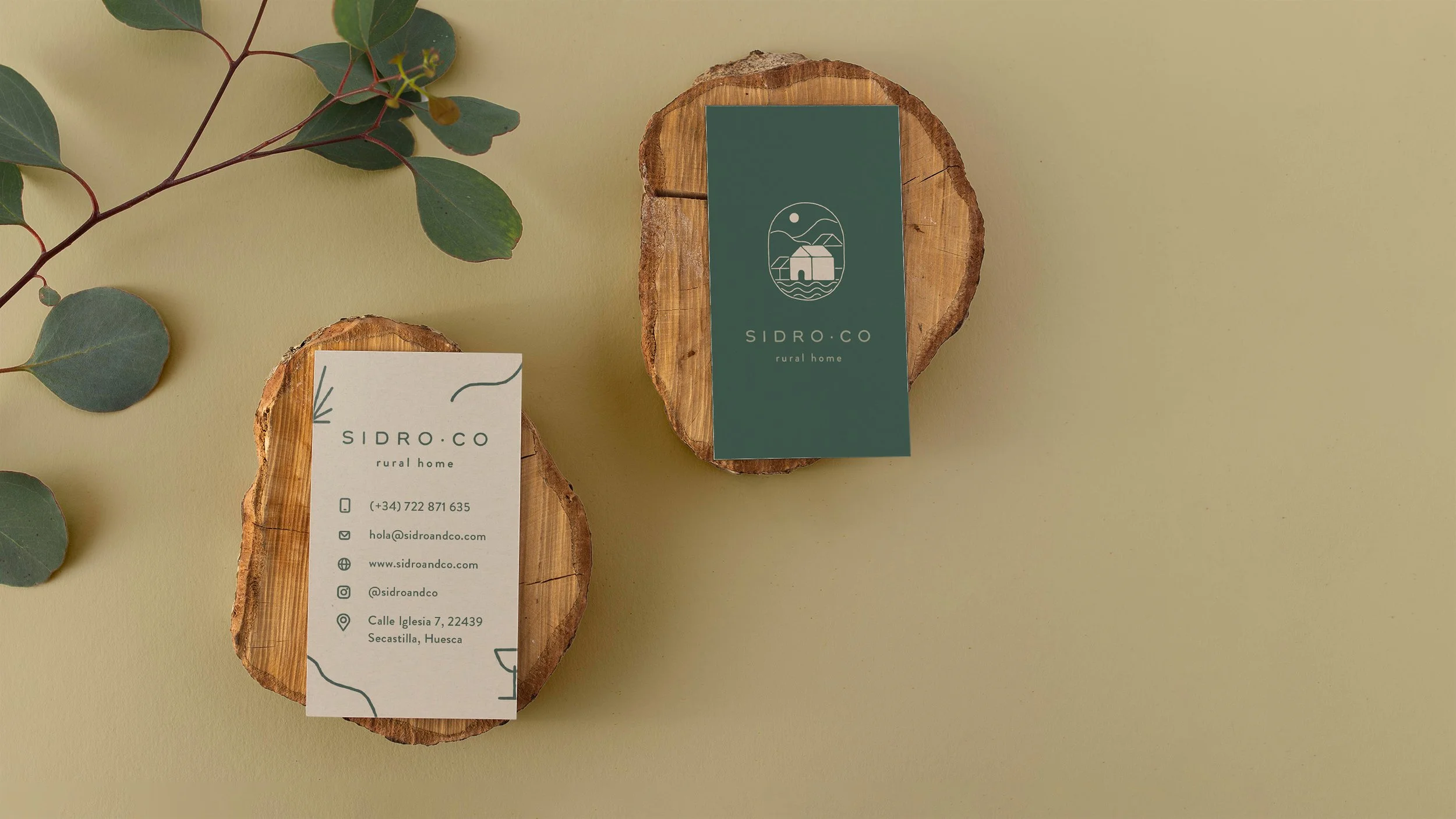
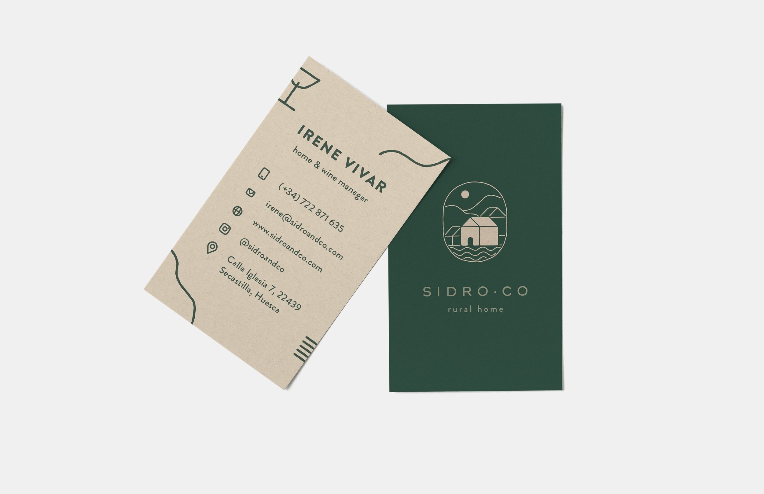
The icon is designed inside an imperfect oval shape, which symbolises comfort and cozyness. The key central element is the house. It is surrounded by other buildings, which is a visual connection with the location of Sidro·Co (town of Secastilla). The town is wrapped in nature: mountains and lakes. Above the house we have a small sun, which can be interpreted as a reference to the spiritual energy that the area has.
Colors
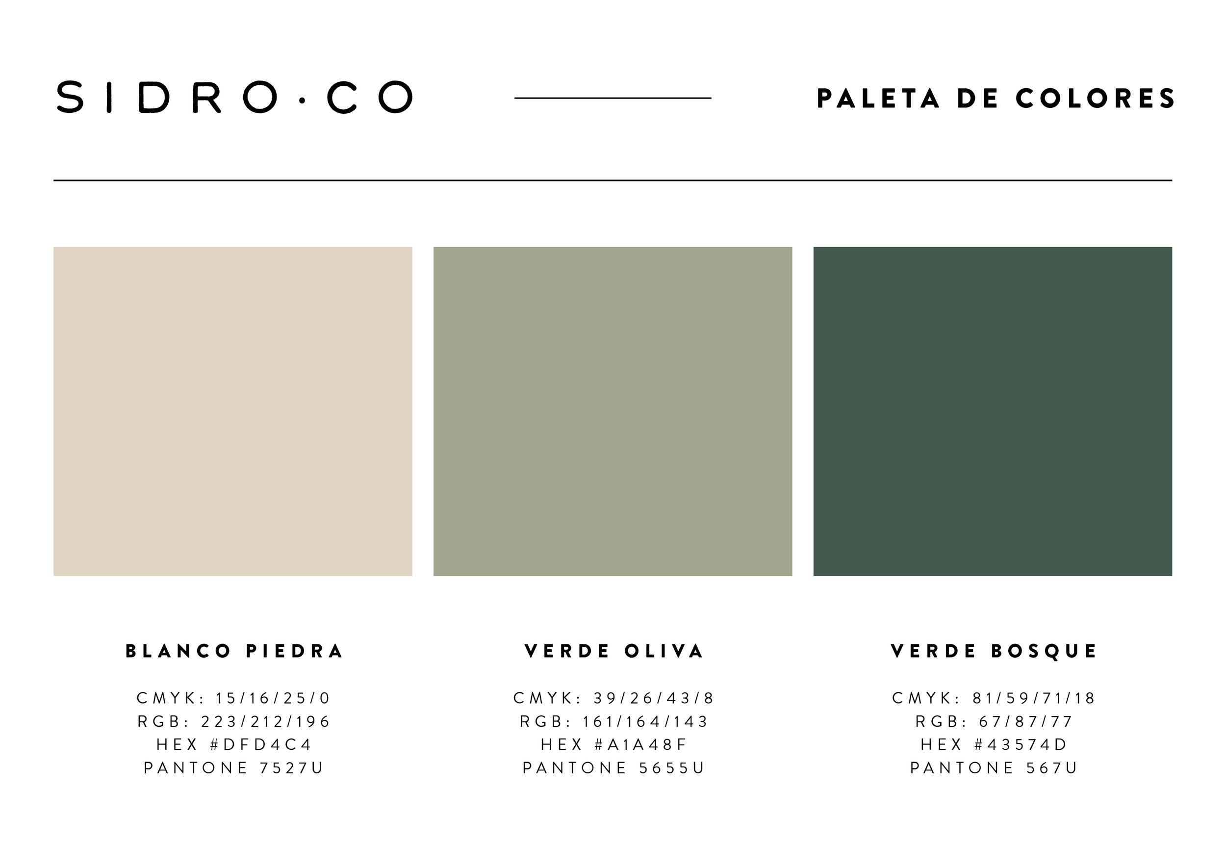
The color palette is inspired by the area surrounding the house. With two shades of green we try to represent the endless forests and natural parks surrounding the area, as well as olive and wine fields. The contrasting beige color symbolises the calmness of the house. It also creates a visual link to the color of the stone that was used to build the town of Secastilla.

